


[click or press space to pause]
[click or press space to pause]
Last updated June 1, 2025
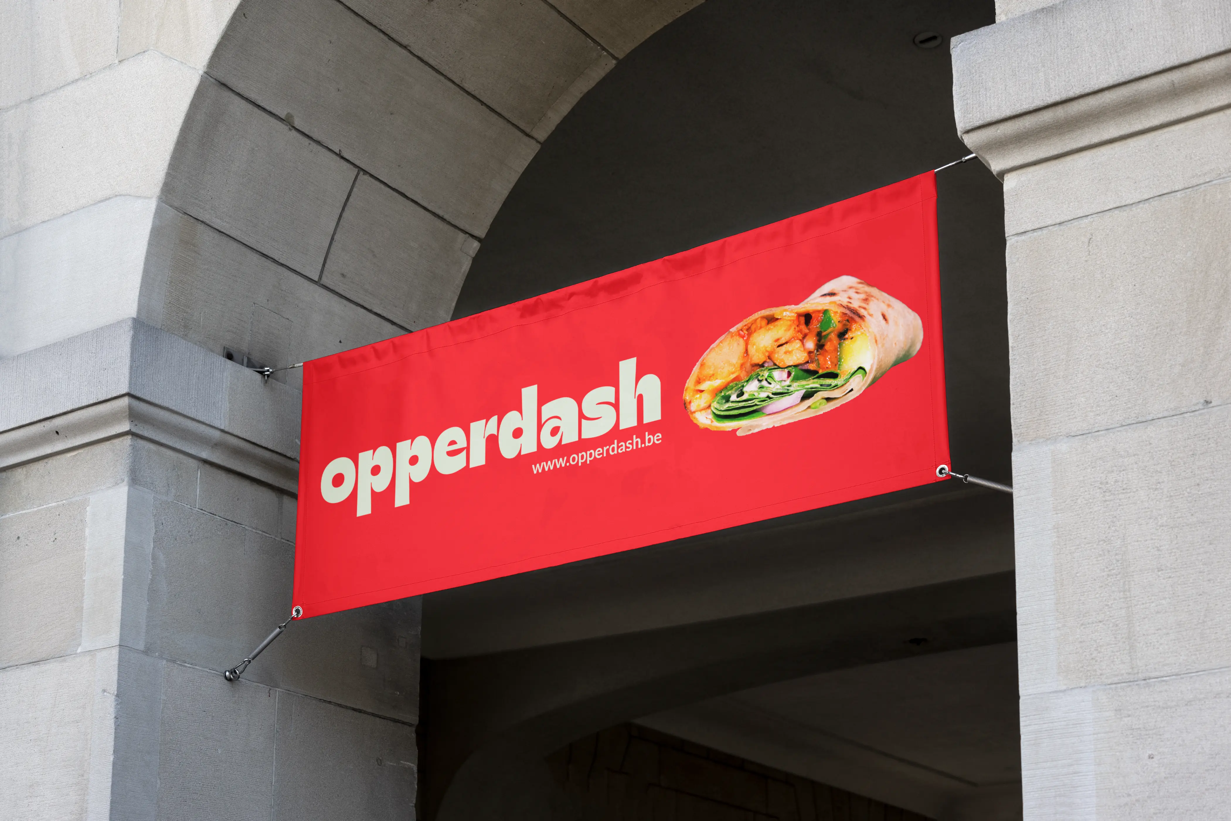


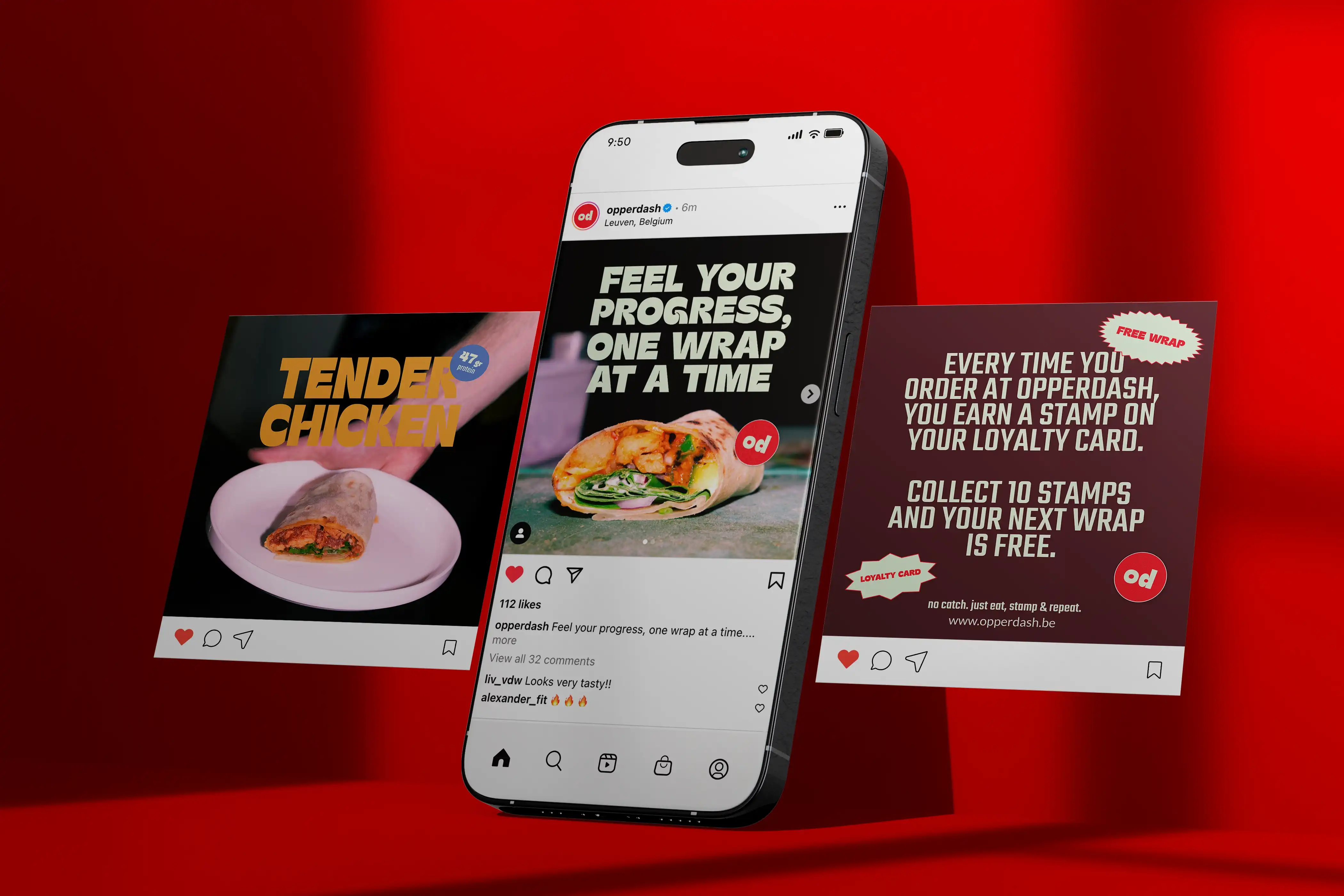
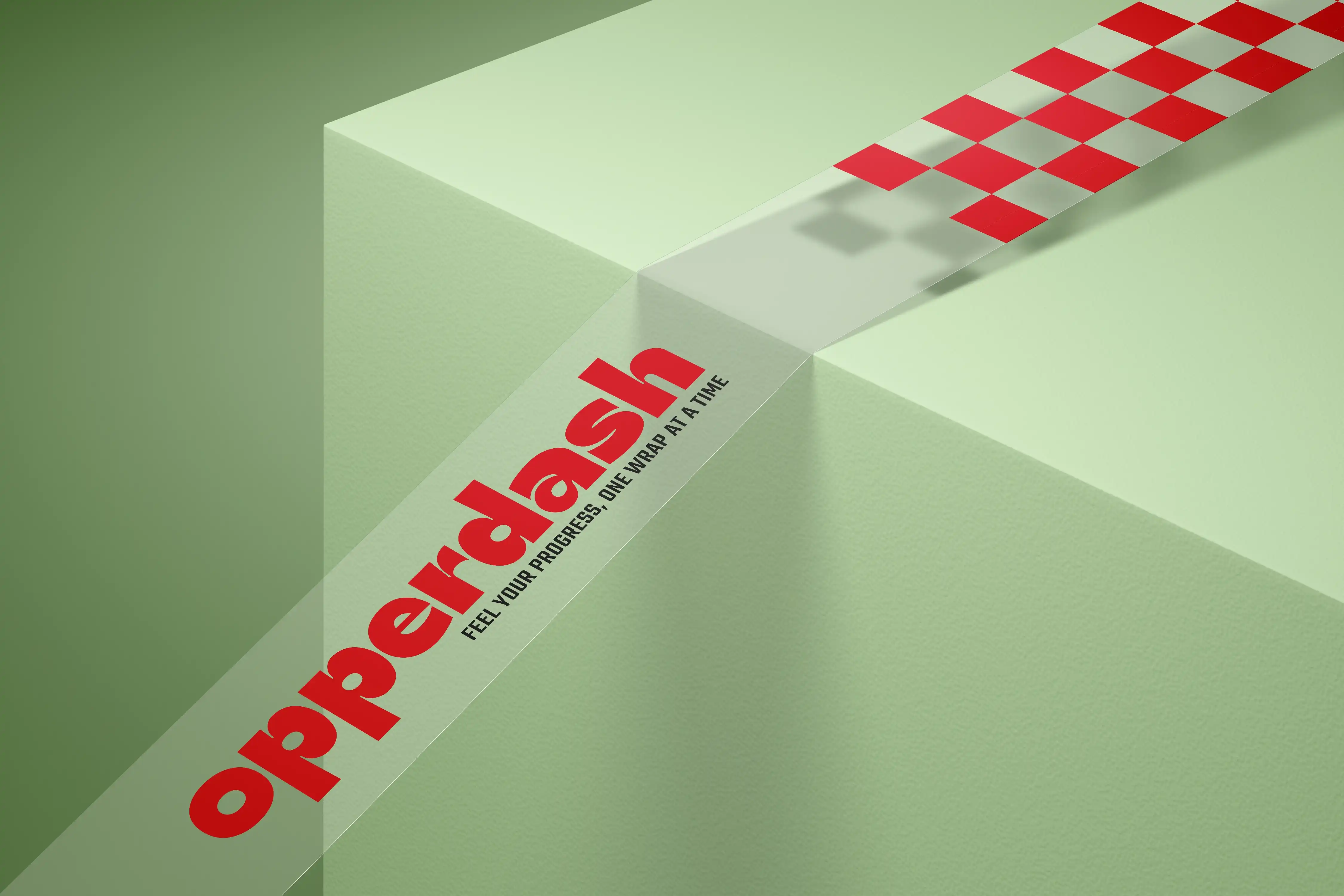
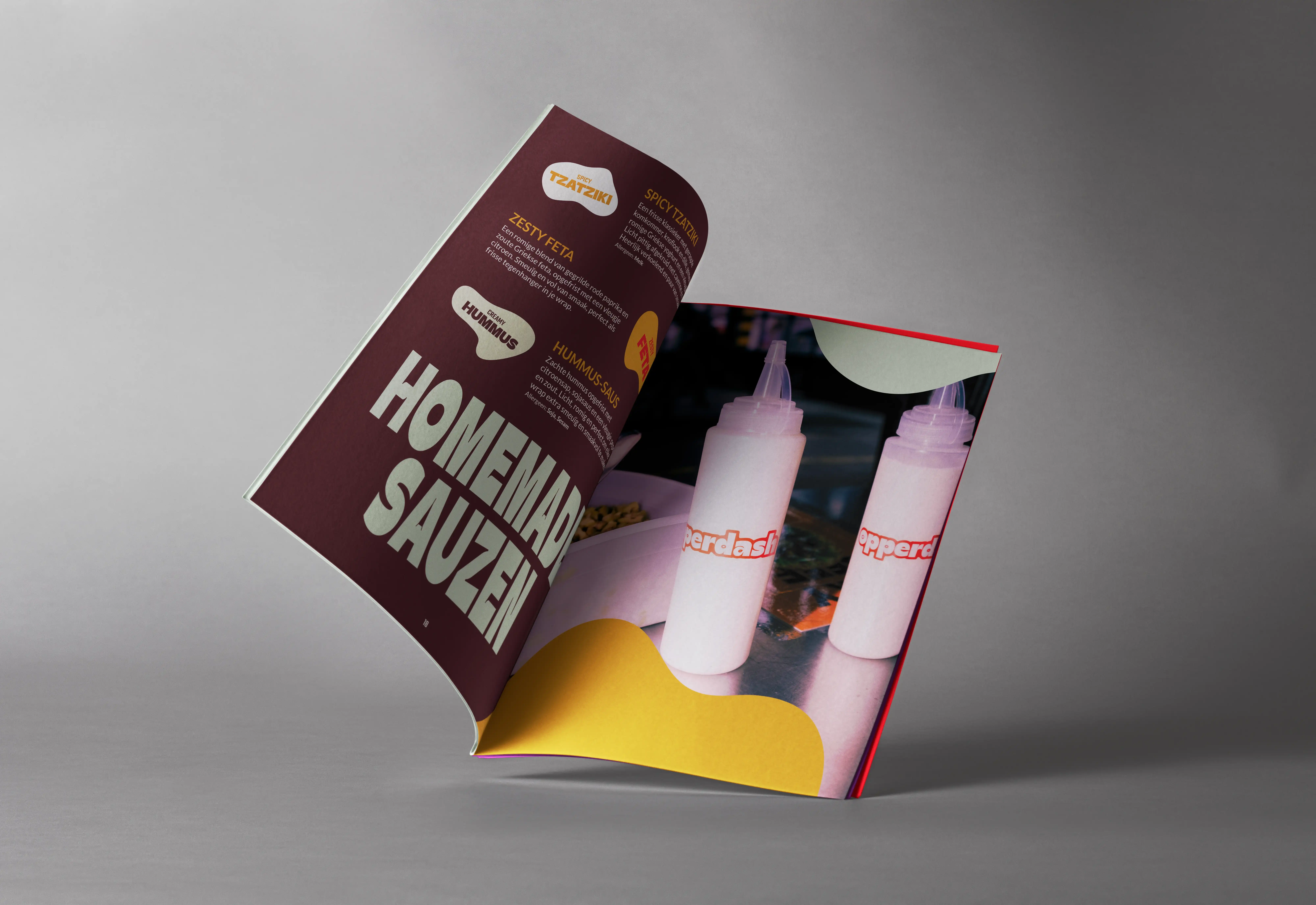
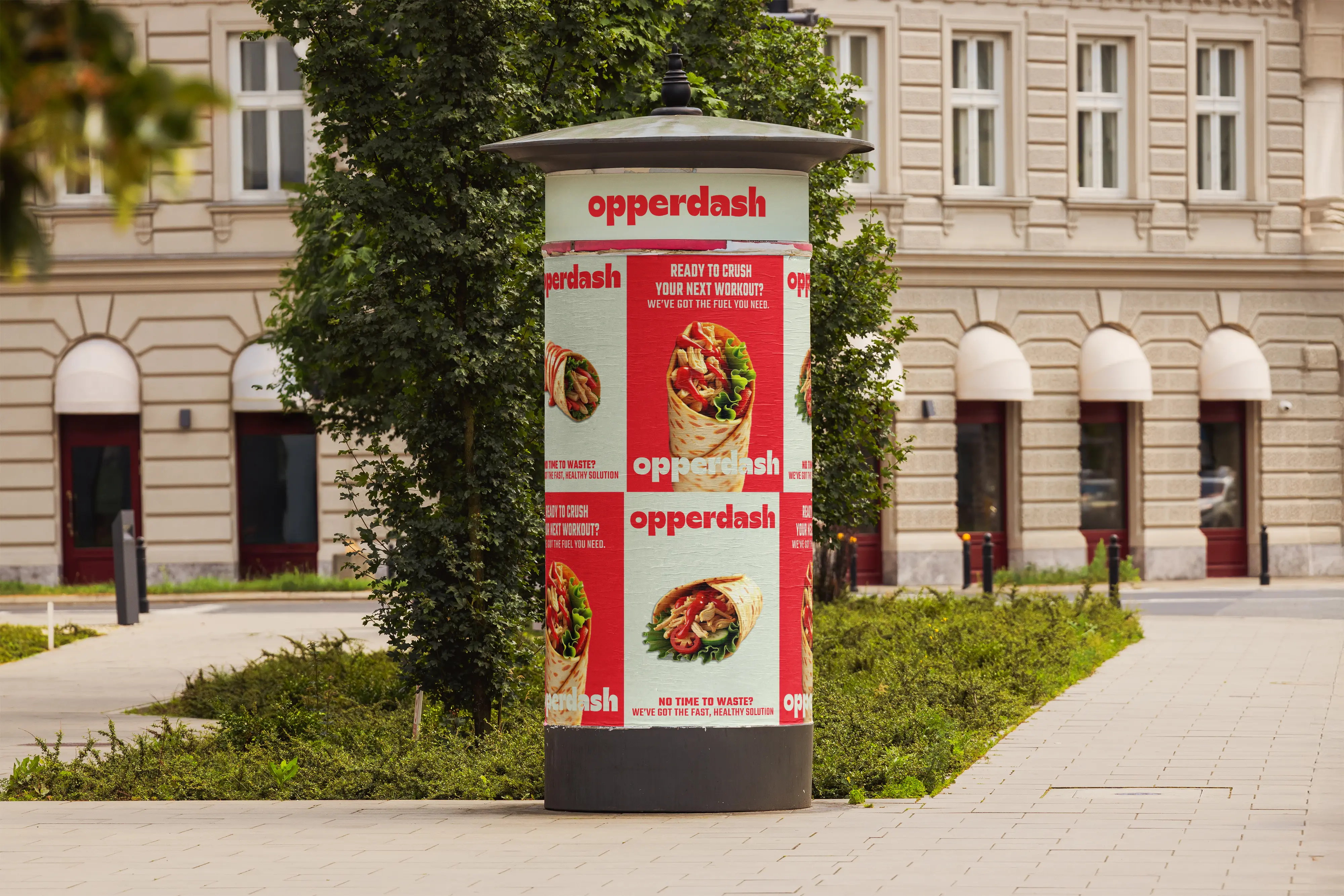
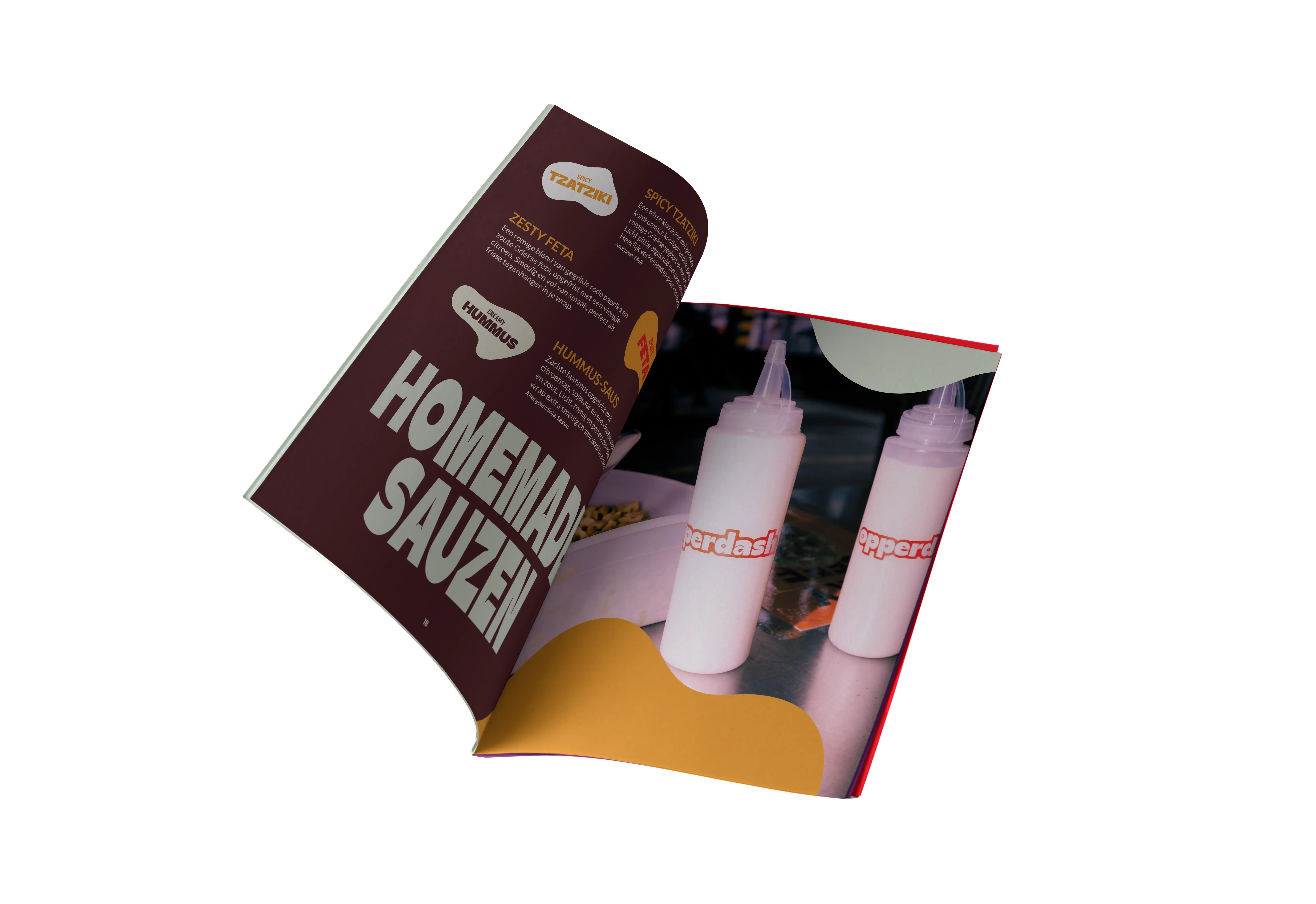
OpperDash is more than a foodtruck — it’s a movement. Serving fresh, healthy, protein-packed wraps, the brand exists to put people in their power. Through a bold yet playful graphic system, OpperDash reminds its community that they’re doing great — and deserve to feel strong, seen, and nourished. From custom photography to a scroll-stopping visual identity and a big-ass website, every detail radiates vibrant energy and calm confidence. OpperDash is a fitness-focused brand that dares to be sexy, loud, and trend-forward — while staying grounded in health and intention.
Concept & Design: Wolf Ver Elst • Photography by: Staf Smets
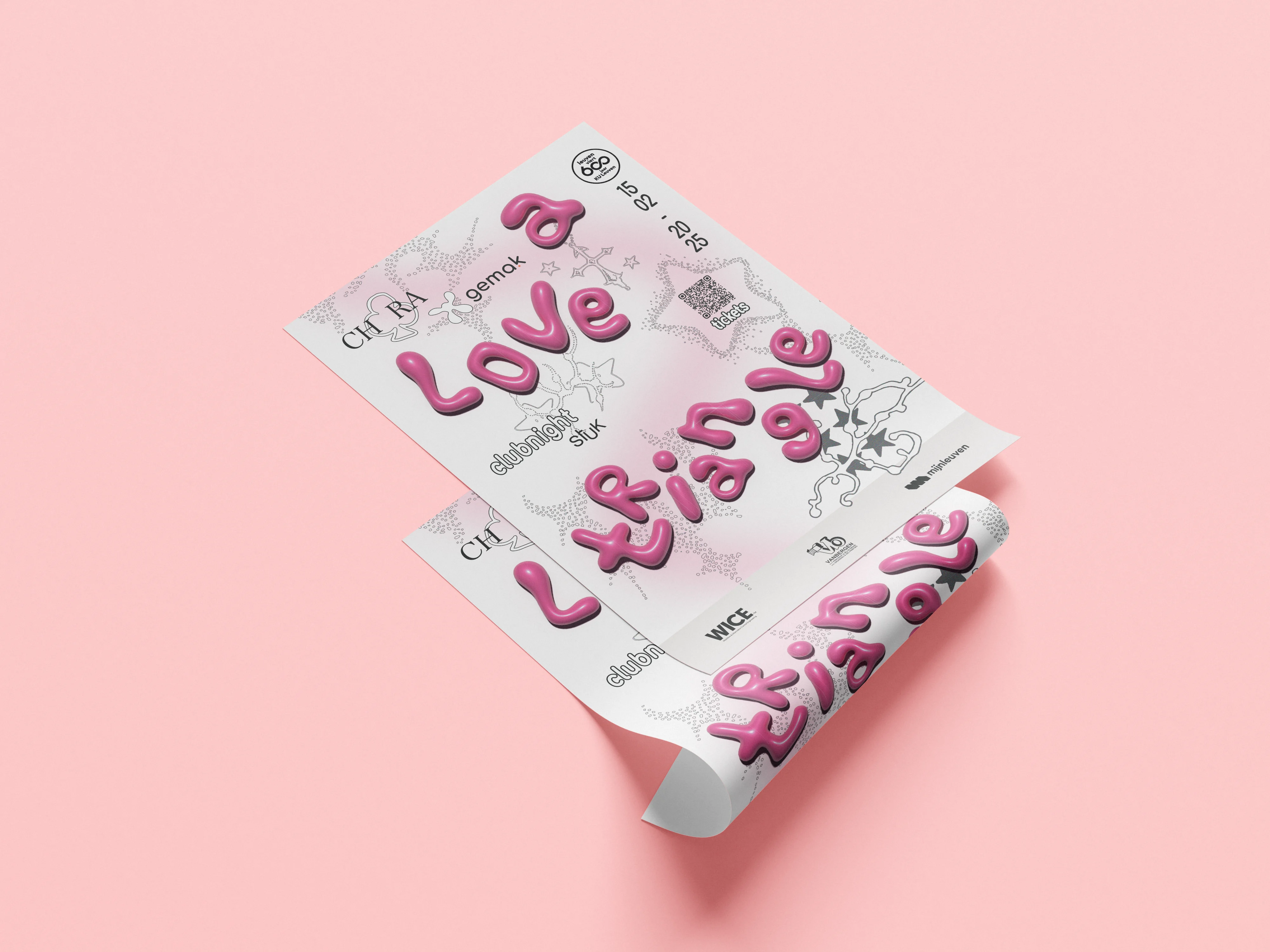

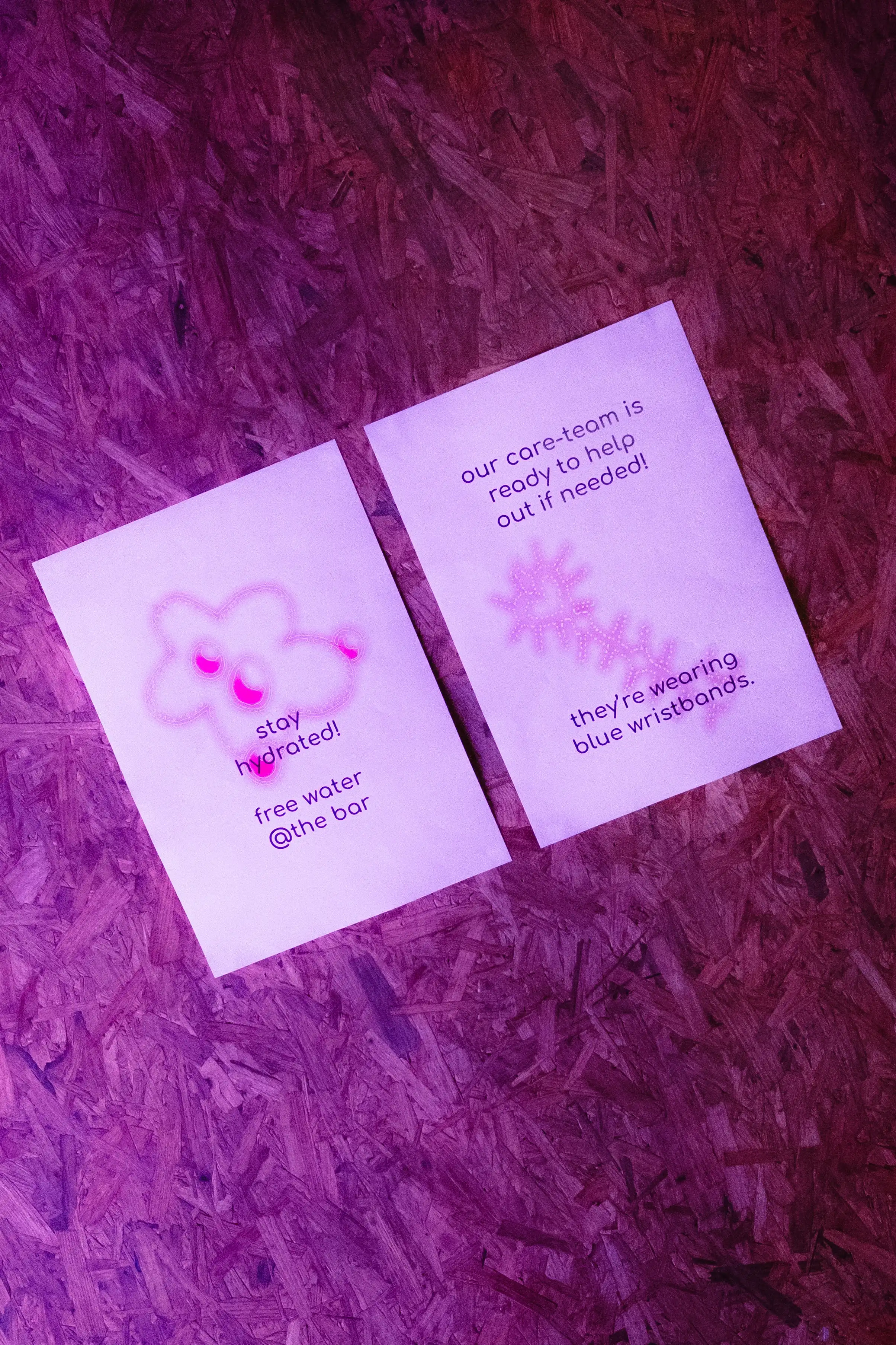
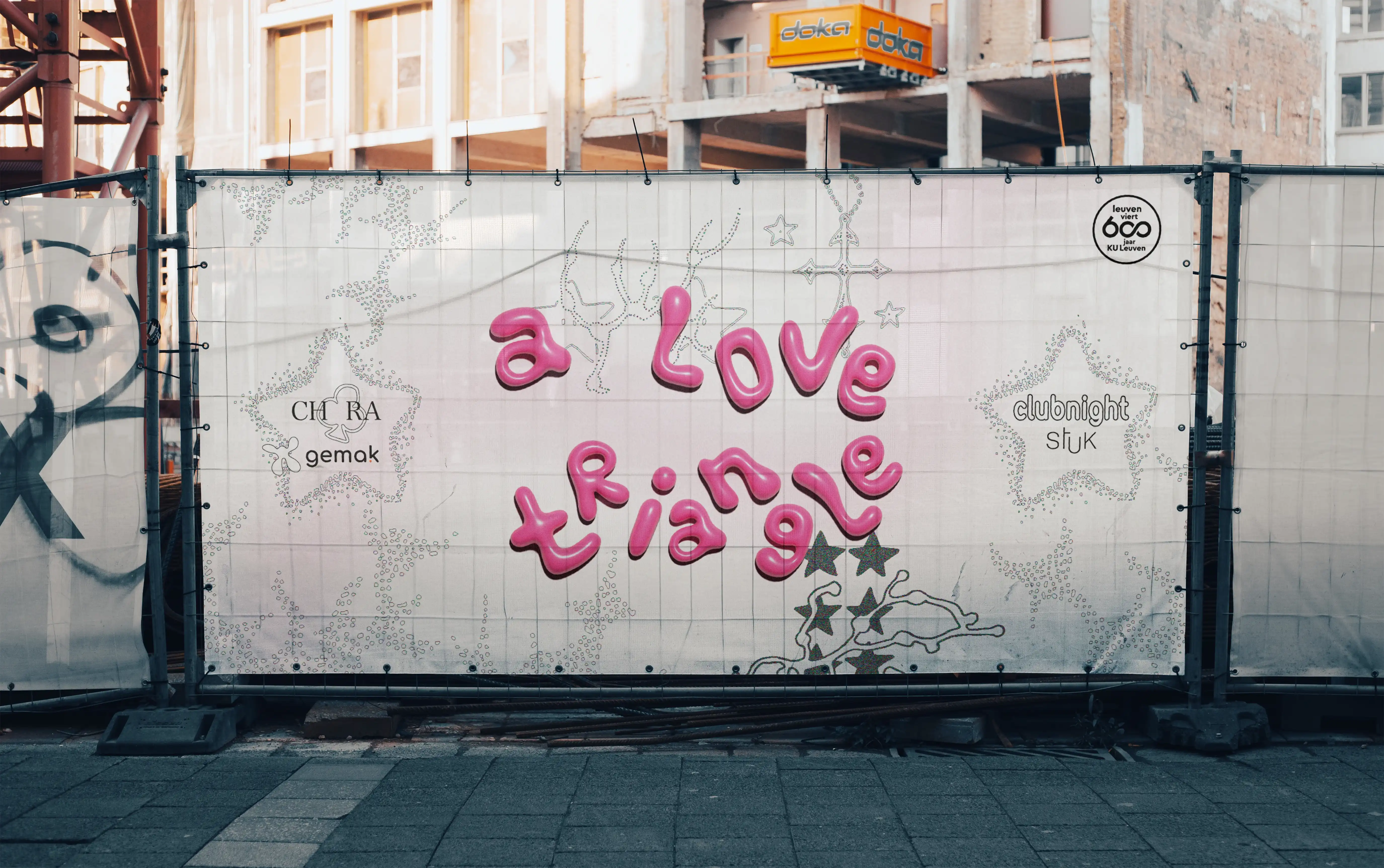
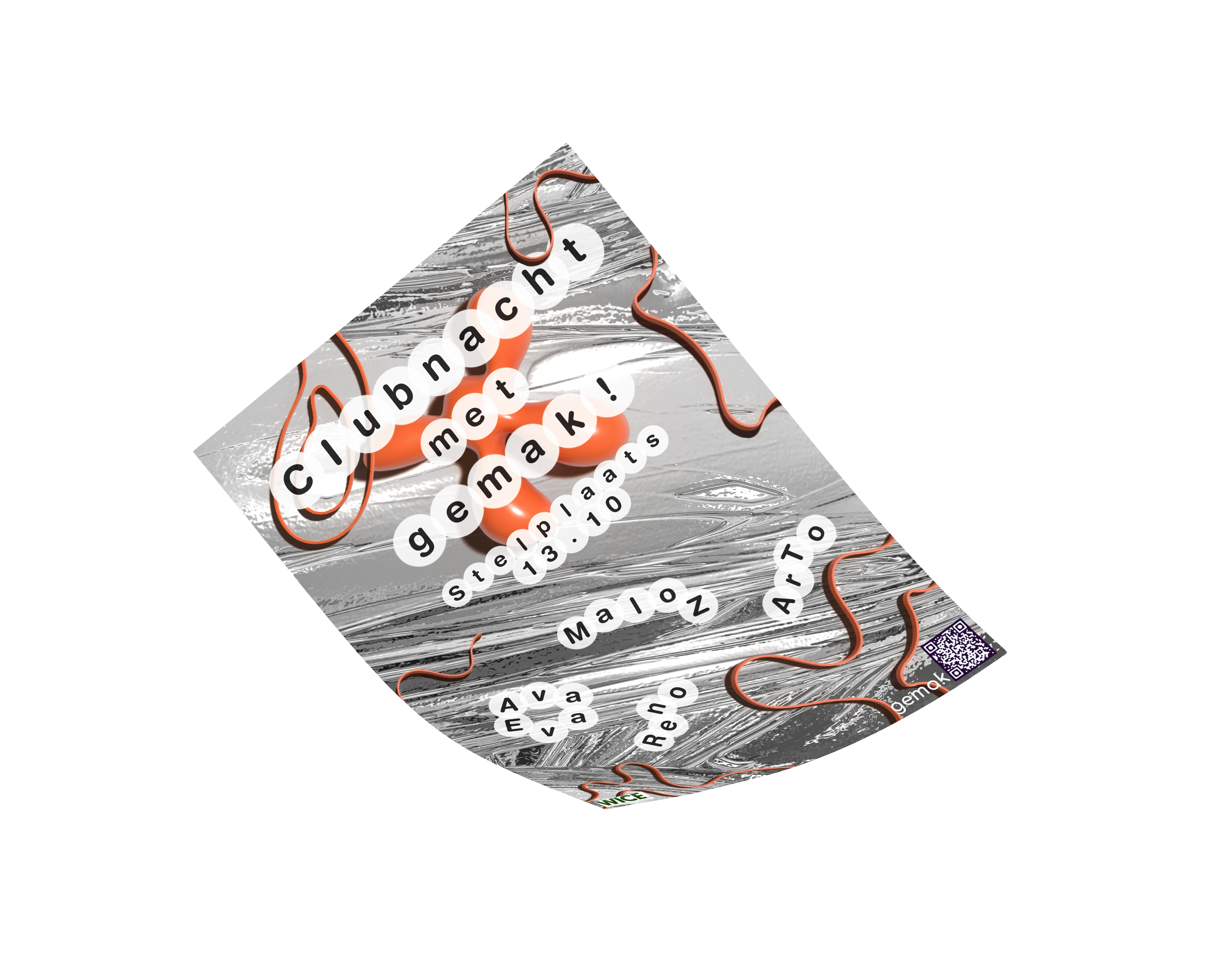
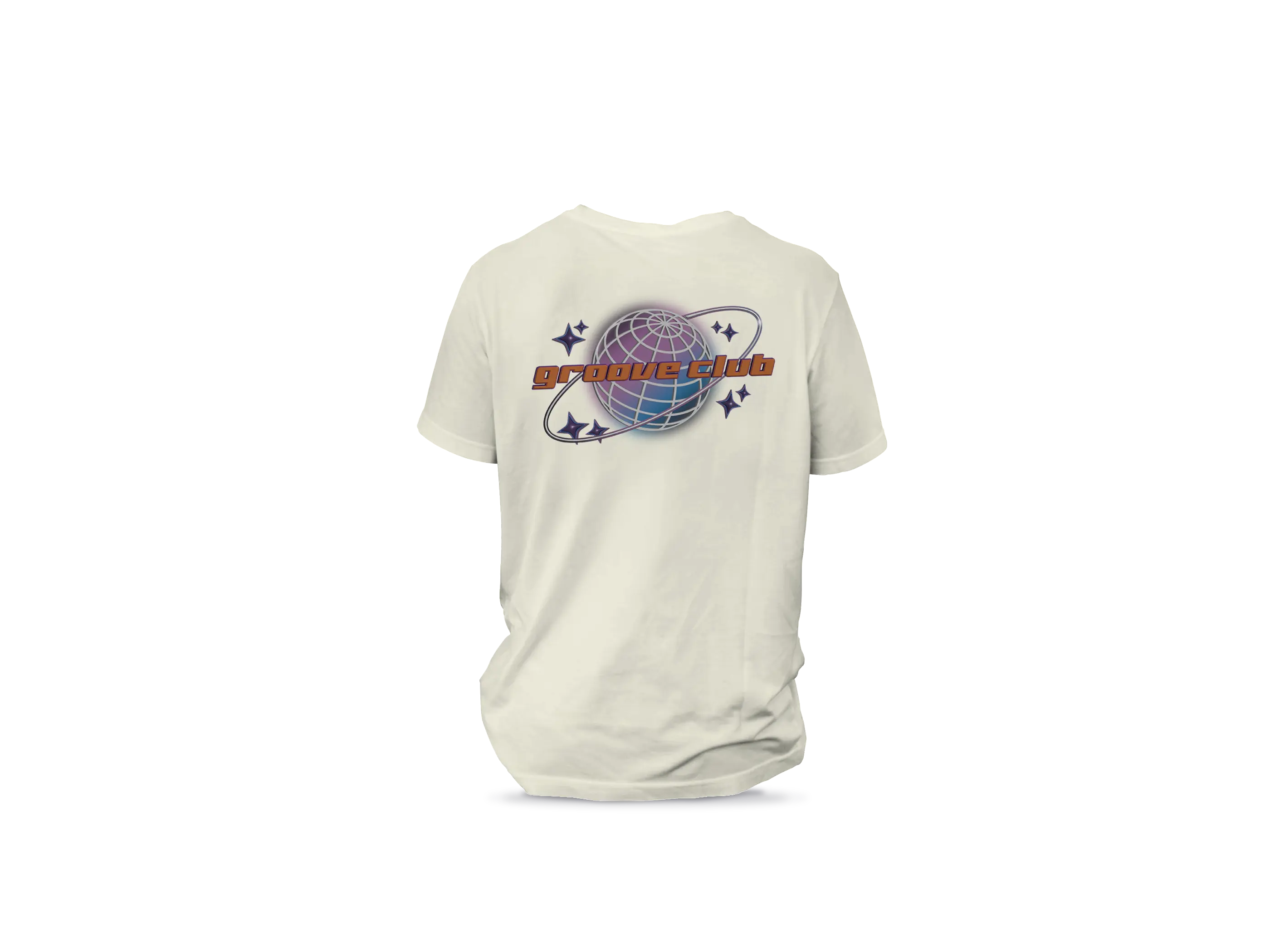
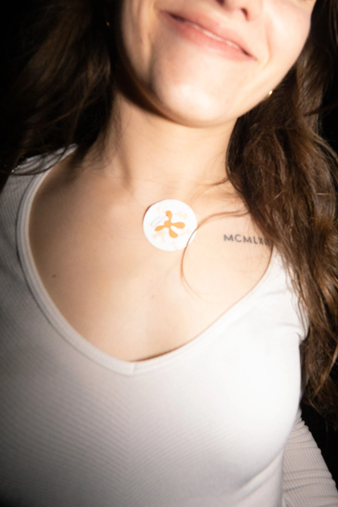
For this sold-out club night at STUK – House for Dance, Image & Sound, Marte Forier and I teamed up to create a 2-style-combining and loving visual world. The result? A graphic identity full of contrast — soft and sharp, warm and wired — blending the vibes of both collectives into one cohesive (and cute) story of connection. From posters to digital social media posts, we built a good looking visual system that celebrated love in all its shapes, while staying true to the vibrant energy of both collectives. A true collaboration, full of creative ping-pong, late-night edits, and finding a shared vision.
Concept & Design: Marte Forier & Wolf Ver Elst • Photography by: Staf Smets & Margot Nootens
In collaboration with: chora, gemak!, STUK Leuven and KU Leuven
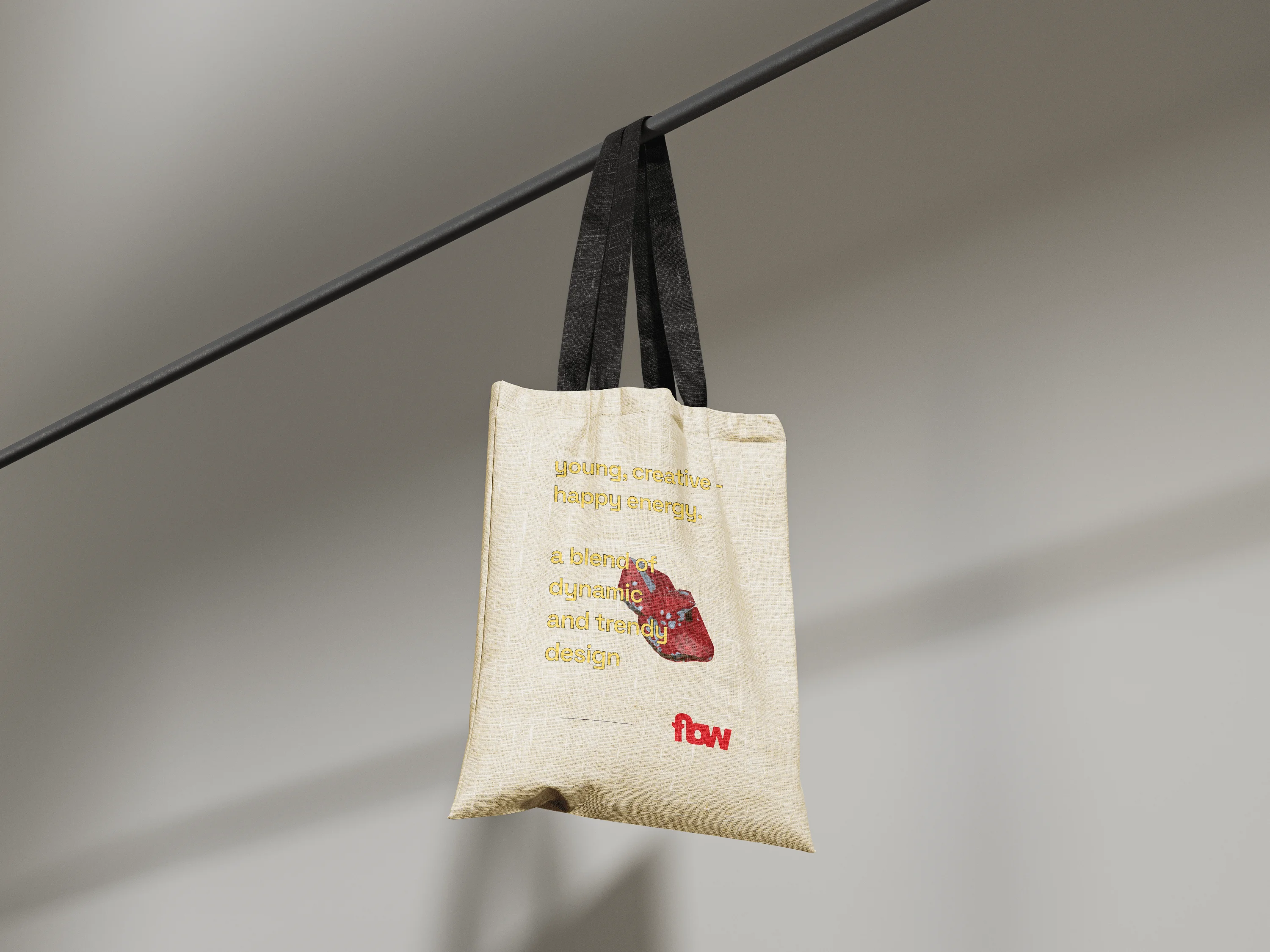
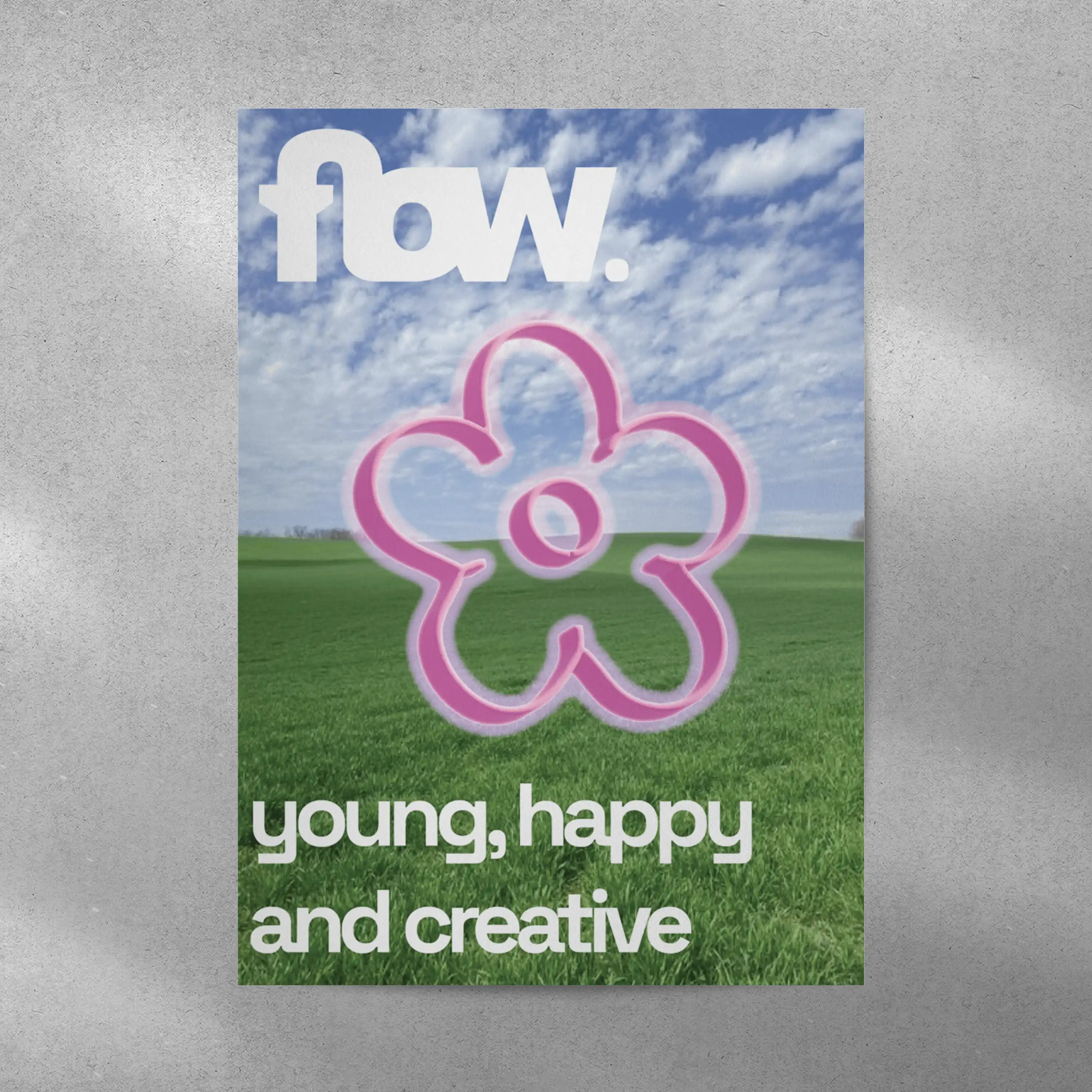
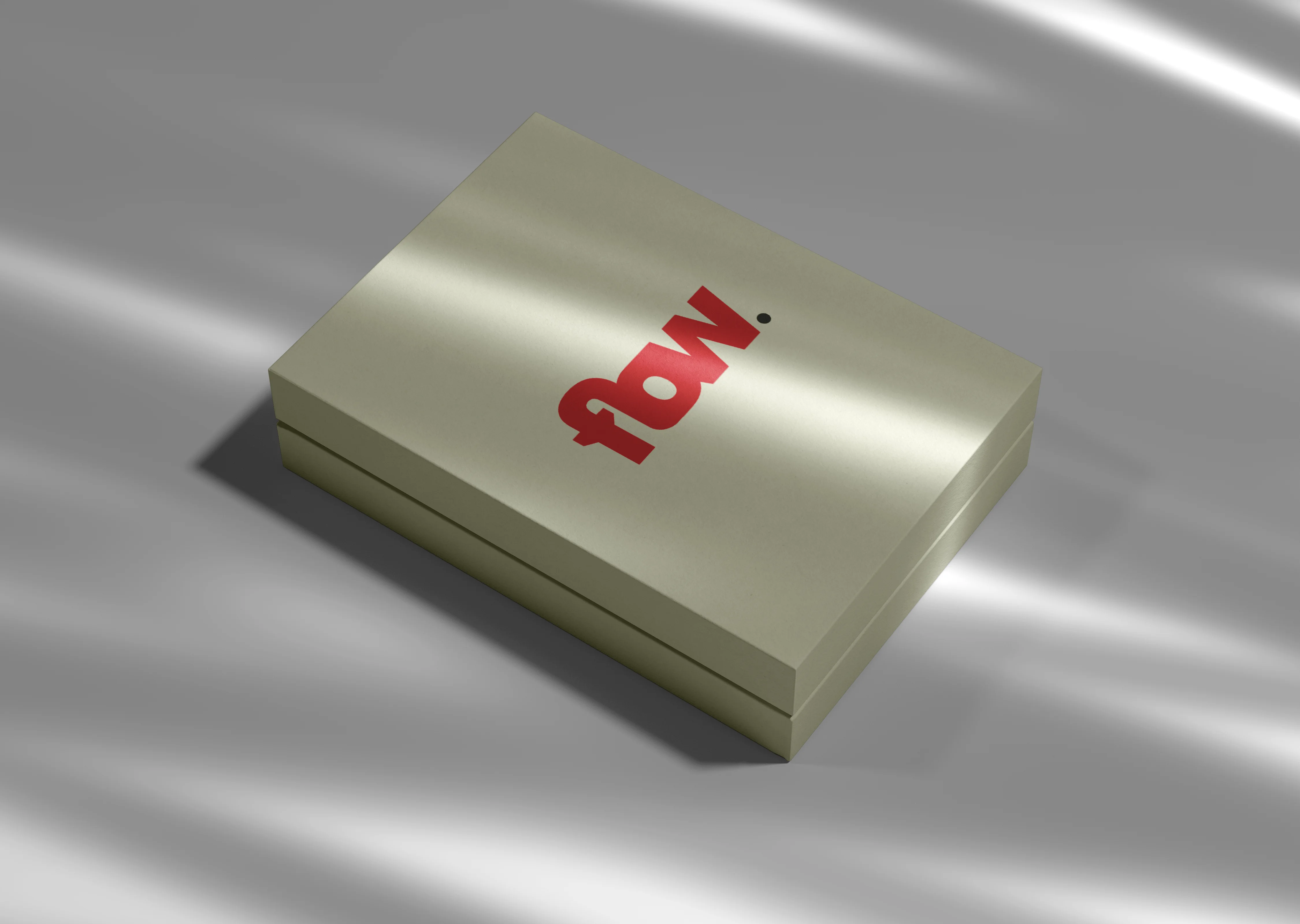
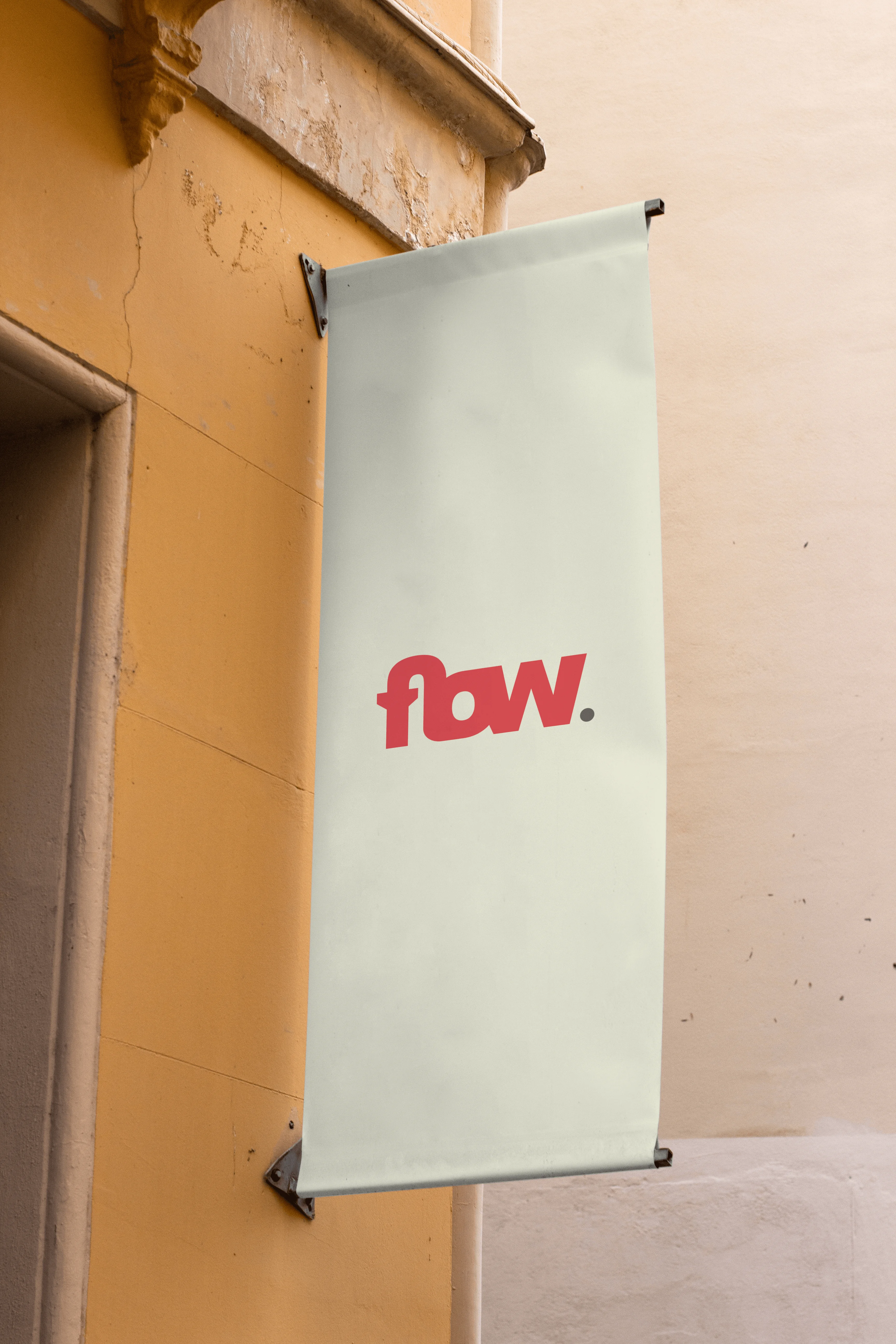

flow., or my own name backwards. I created a brand identity for myself as a school assignment in 2023, this project was my first deep dive into building a full-scale brand identity from the ground up. It was more than just a design task; it was about translating who I am into a visual and conceptual language. As a dynamic, trend-aware creative, I wanted my brand to reflect my adaptability and fresh perspective. Like a river carving its own path, flow. represents the fluid energy I bring to every project. Whether I’m designing in 3D or experimenting with motion and visuals, I aim to blend elements seamlessly, always keeping things current and engaging.
Concept & Design: Wolf Ver Elst
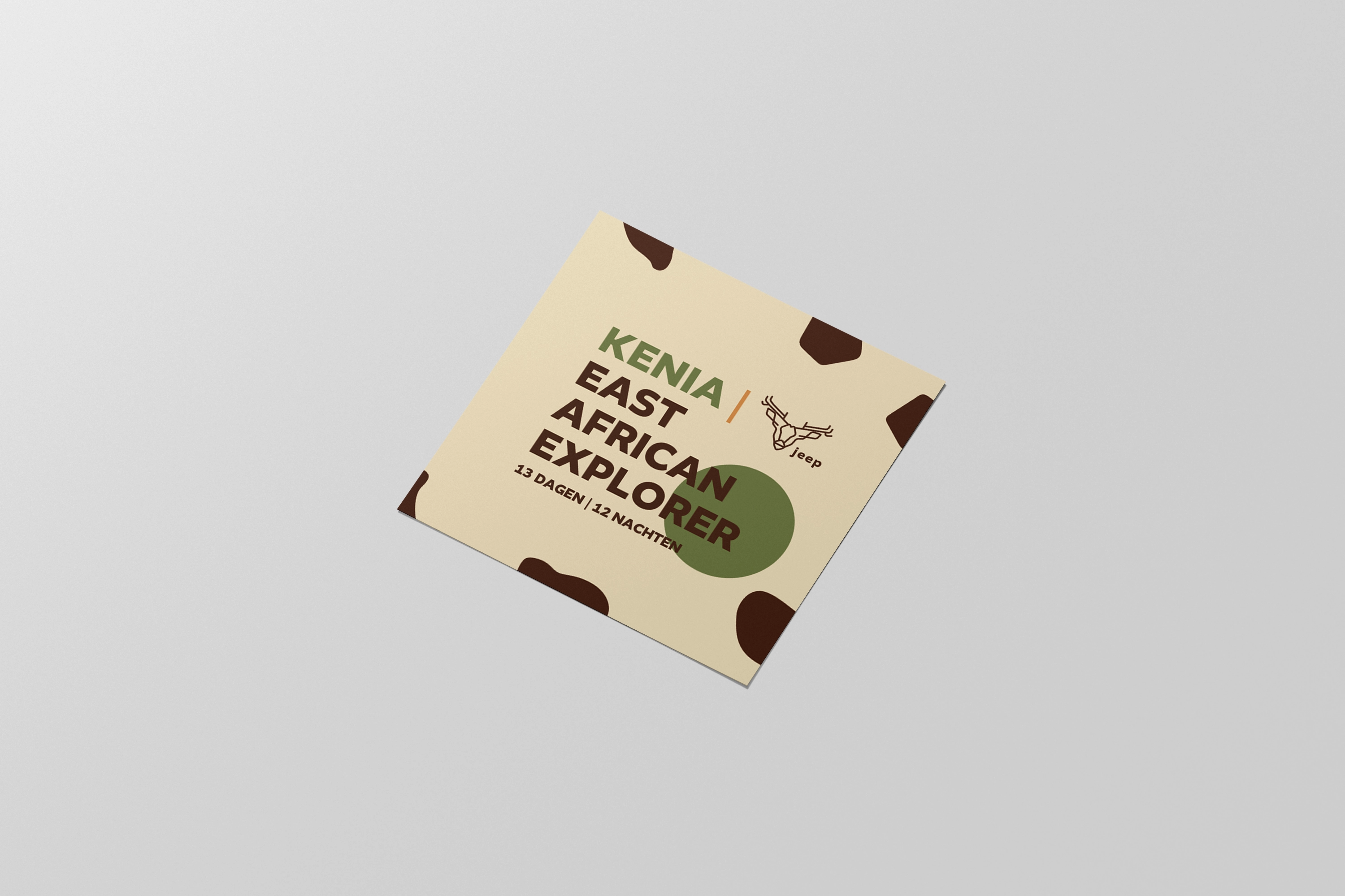
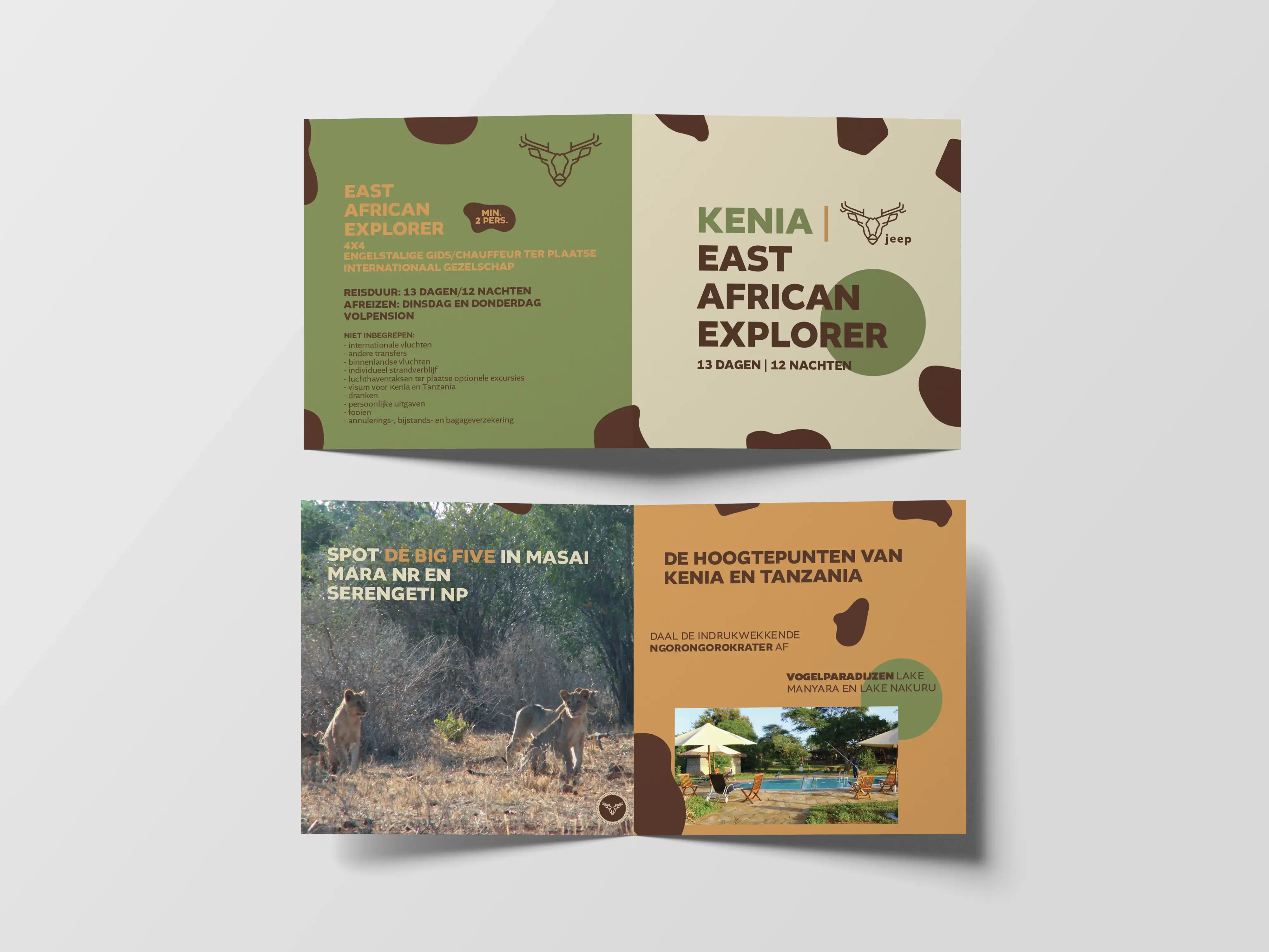
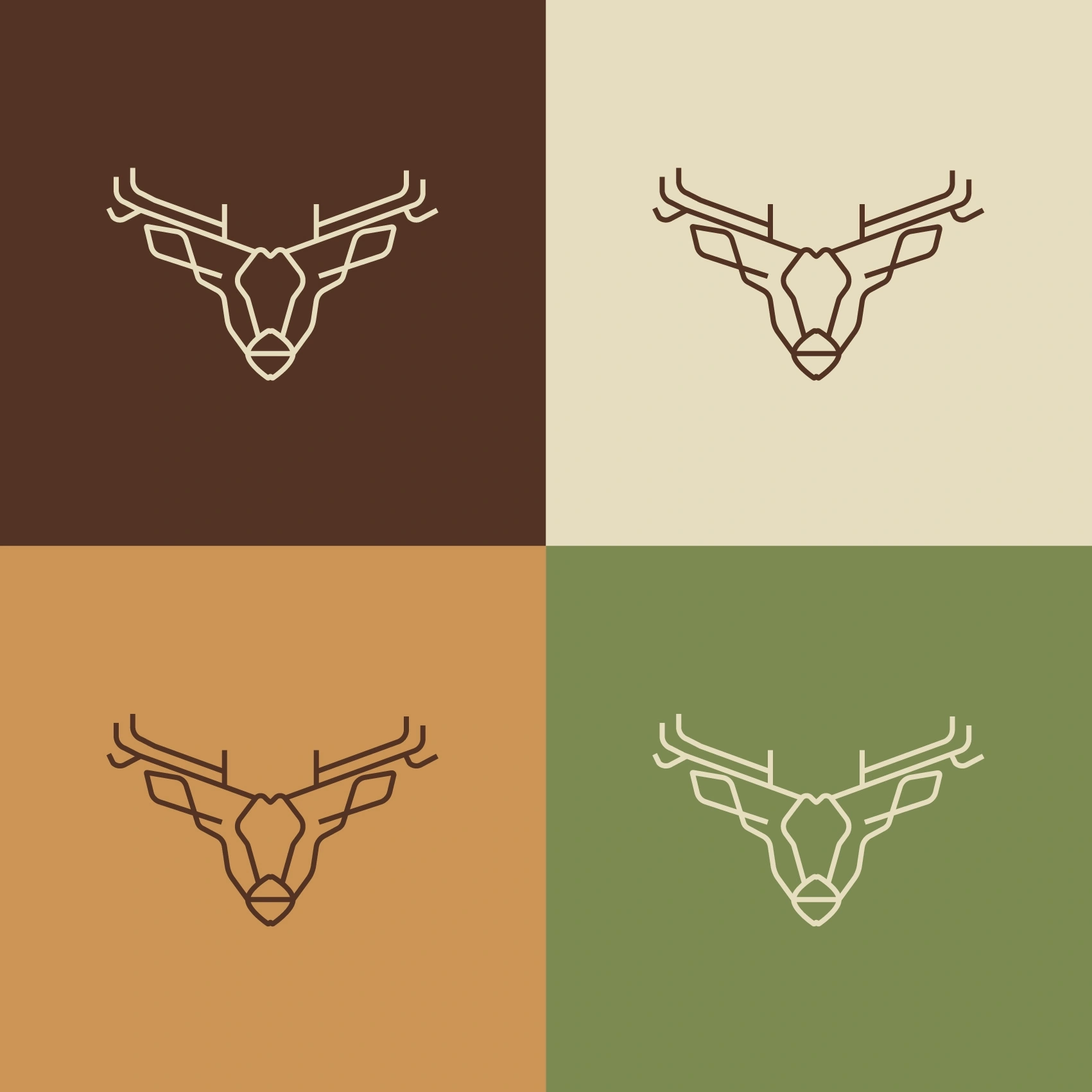
As part of an exam assignment in 2024, I designed a bold and stylish promotional folder for a fictional brand: Jeep – with one clear goal in mind: to make safaris wild, thrilling, and sexy again. The concept leans into a playful but confident visual style, using flirty, hand-drawn illustrations and a clever folding layout to create something that’s both eye-catching and memorable. The design walks the line between rugged adventure and cheeky elegance, giving the classic safari vibe a modern, fashion-forward twist. This project challenged me to think beyond conventional branding and push the identity into something unexpected yet authentic – a fresh take on how exploration can feel exciting again.
Concept & Design: Wolf Ver Elst
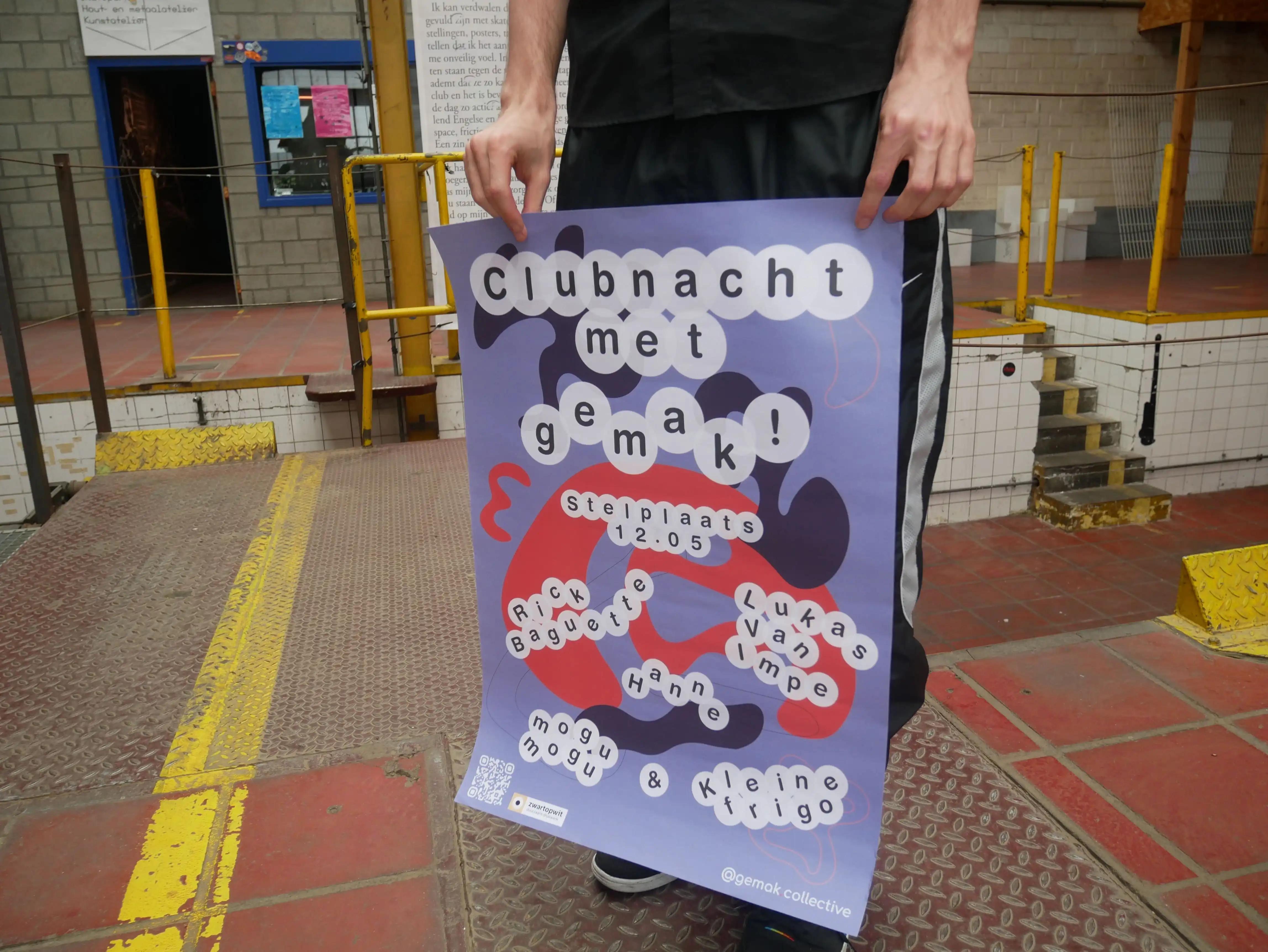
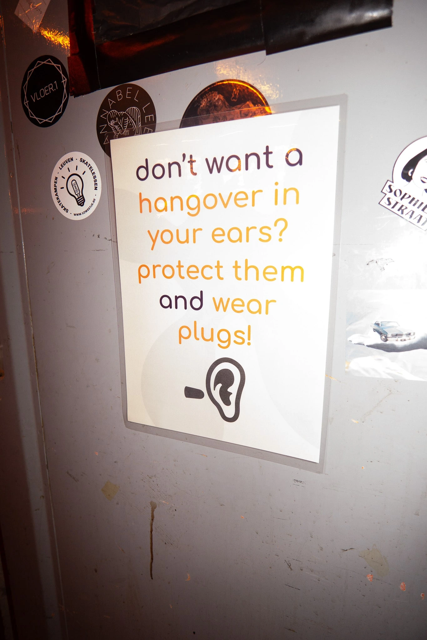
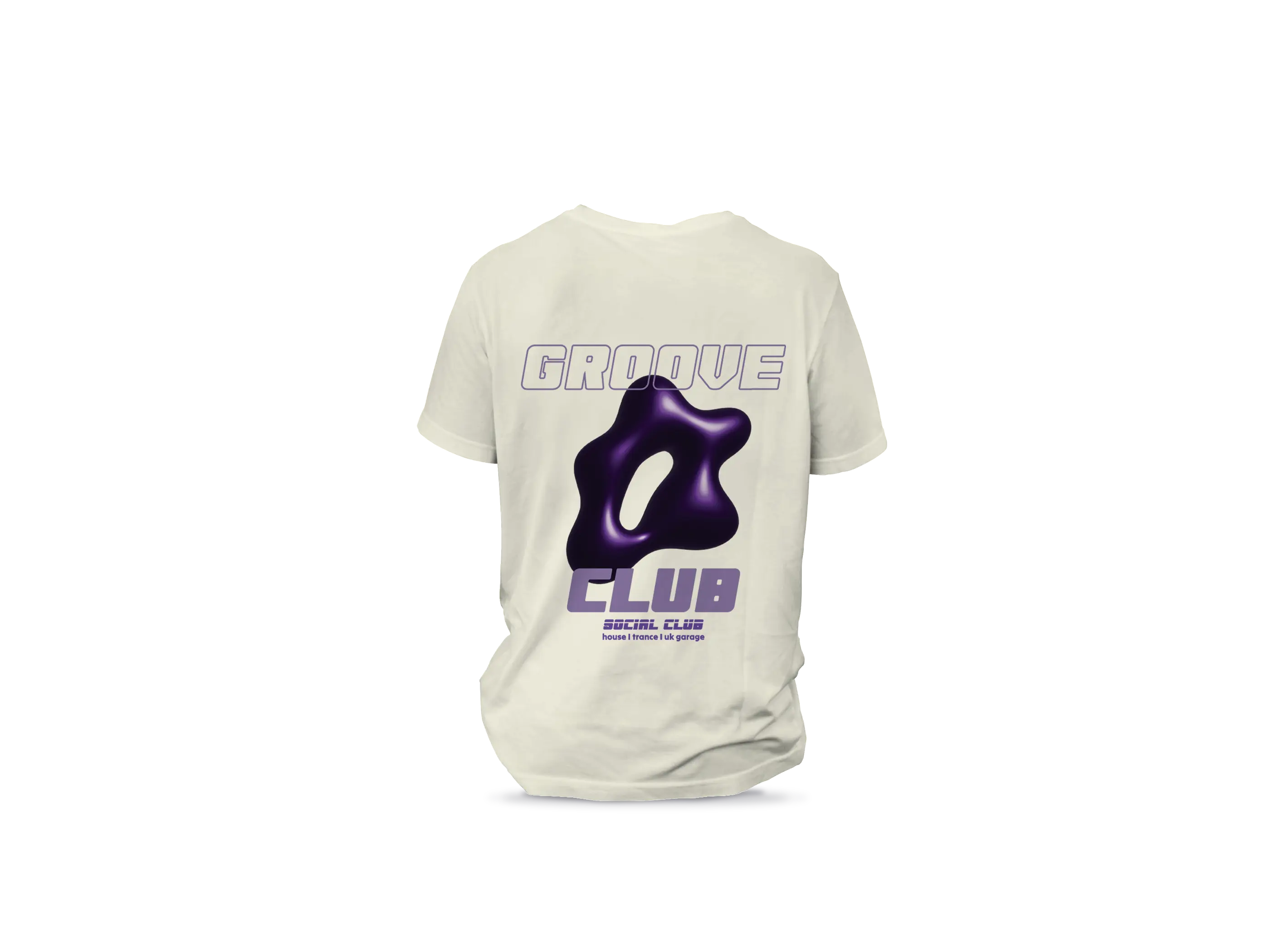
For gemak! collective’s very first event in 2023, I designed a bold and eclectic visual identity that set the tone for who we are. The branding is a direct reflection of our core values: immersion, kindness, and self-cultivation. Each shape and color was carefully chosen to represent different facets of the gemak! experience – from moments of calm and connection to the liberating, playful chaos we embrace. It wasn’t just visual decoration – it was a conversation starter, a mood-setter, and a statement. The final result was intentionally loud, layered, and full of energy – a little chaotic, maybe even too much, but unmistakably us. This project marked the beginning of our visual language and laid the foundation for the collective’s identity moving forward.
Concept & Design: Wolf Ver Elst • Photography by: Ernest Thiesmeier
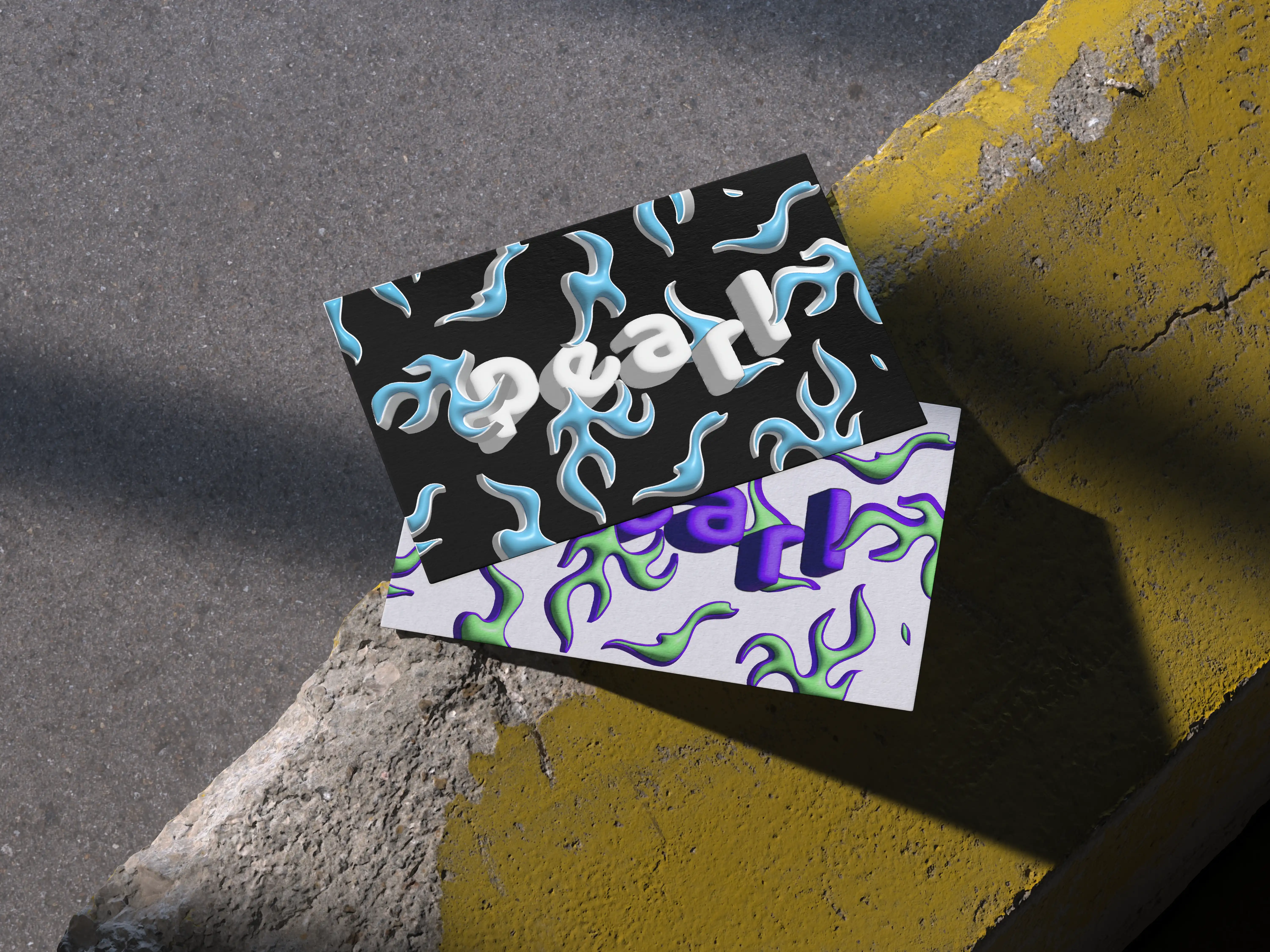
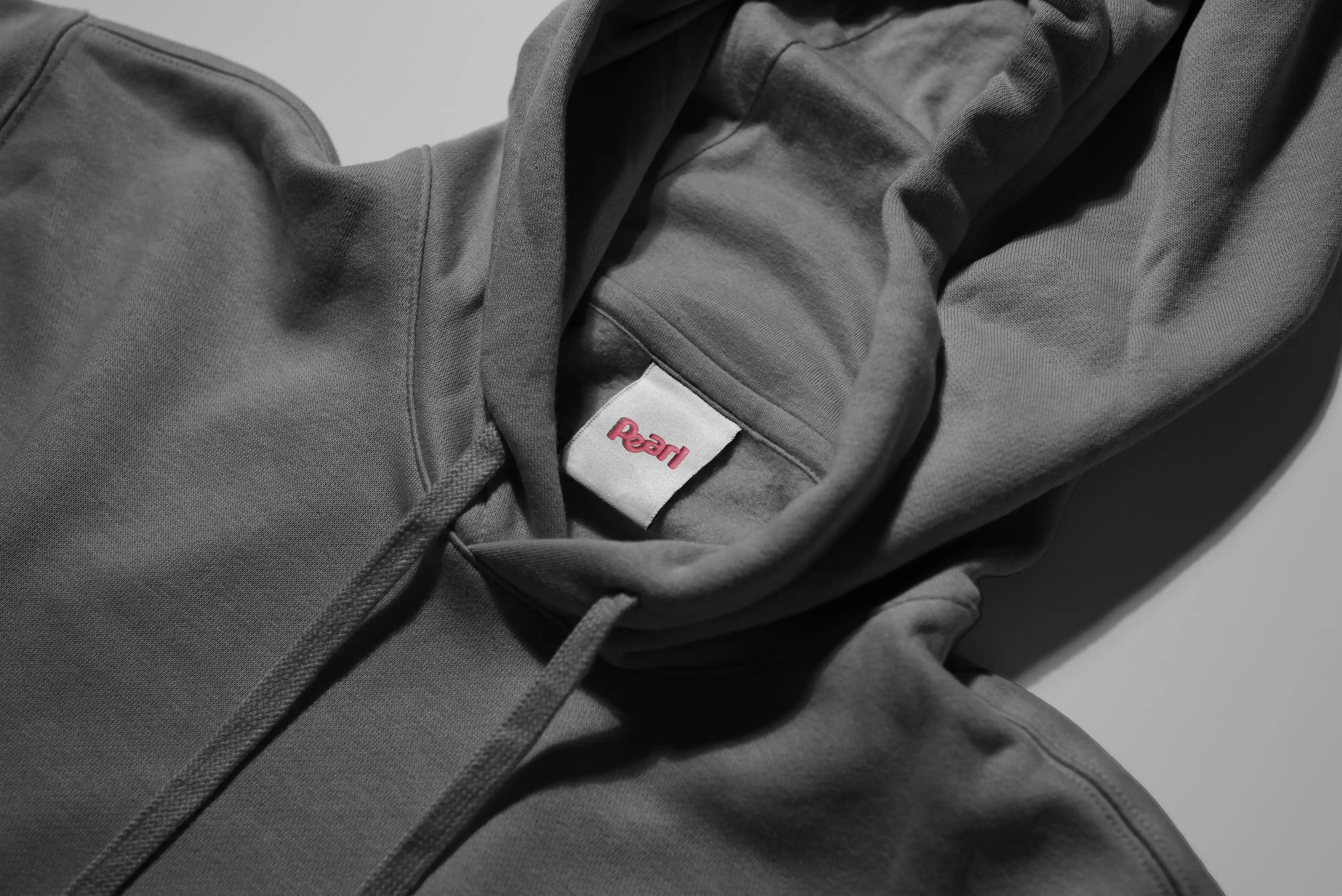
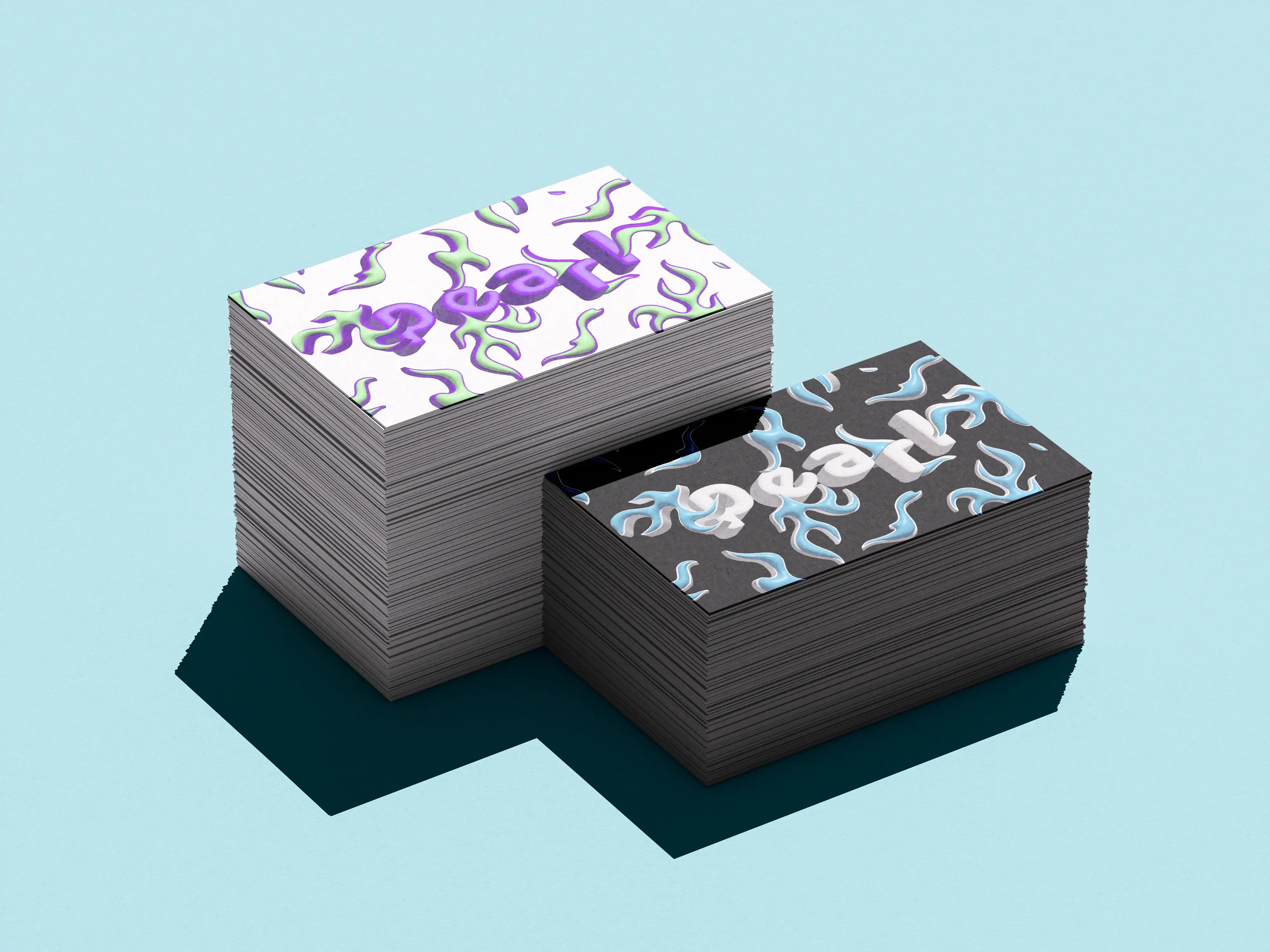
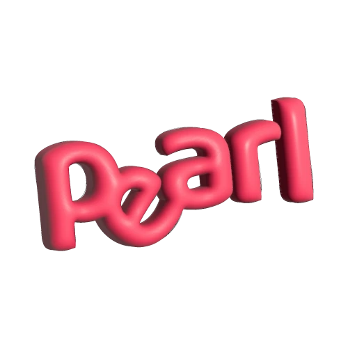
For Pearl Vintage Store’s brand & visual identity, I created a vibrant Y2K-inspired identity that reflected everything the brand stands for – accessibility, individuality, and bold self-expression. As a co-founder and the in-house multimedia designer, I was responsible for shaping the entire visual universe of Pearl – from the stickers on our orders to the TikToks that reached thousands. The look was unapologetically young and playful, grounded in 3D design and abstract shapes that captured the spirit of a generation unafraid to stand out. Every asset – from label prints and reels to scripted video content – was created with one goal in mind: to make sustainable fashion feel accessibile, personal, and fun. Pearl wasn’t just another vintage store. It was a movement. And this identity wasn’t just aesthetic – it was an invitation. An invitation to explore who you are through style. To embrace difference. To wear your values. Through every post, print, and pixel, we built something that felt like more than a brand – we built a vibe, a community, and a statement.
Concept & Design: Wolf Ver Elst
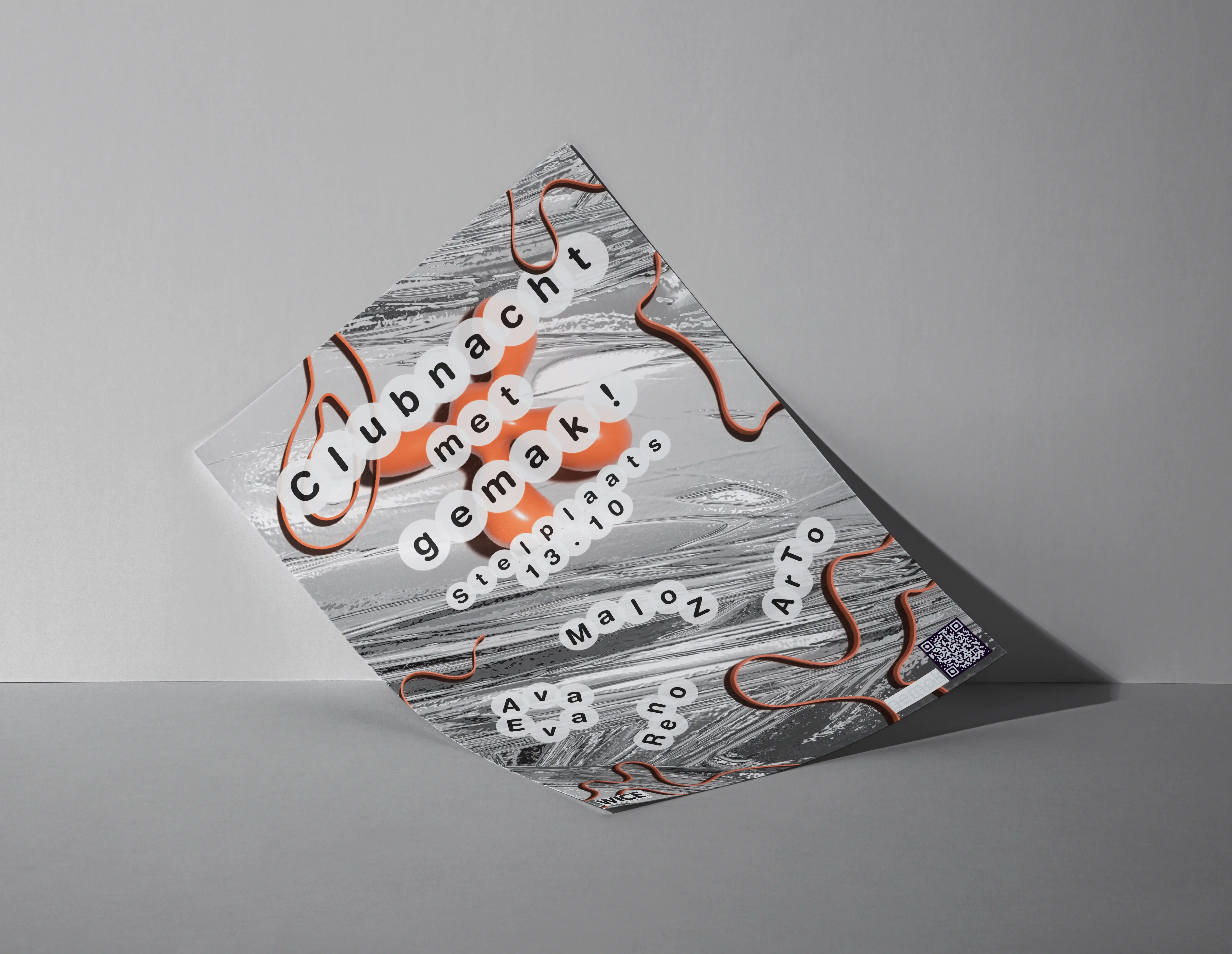

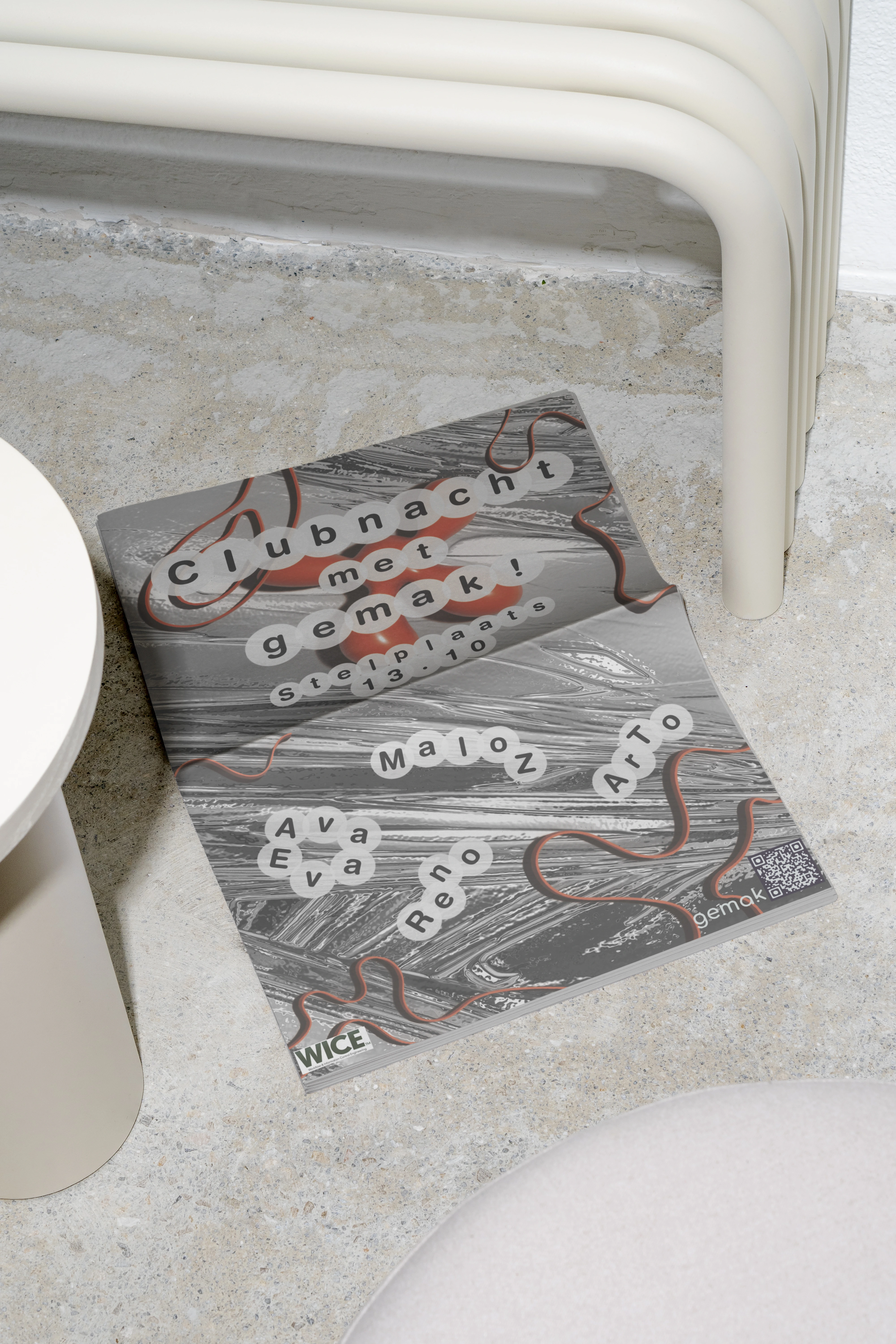
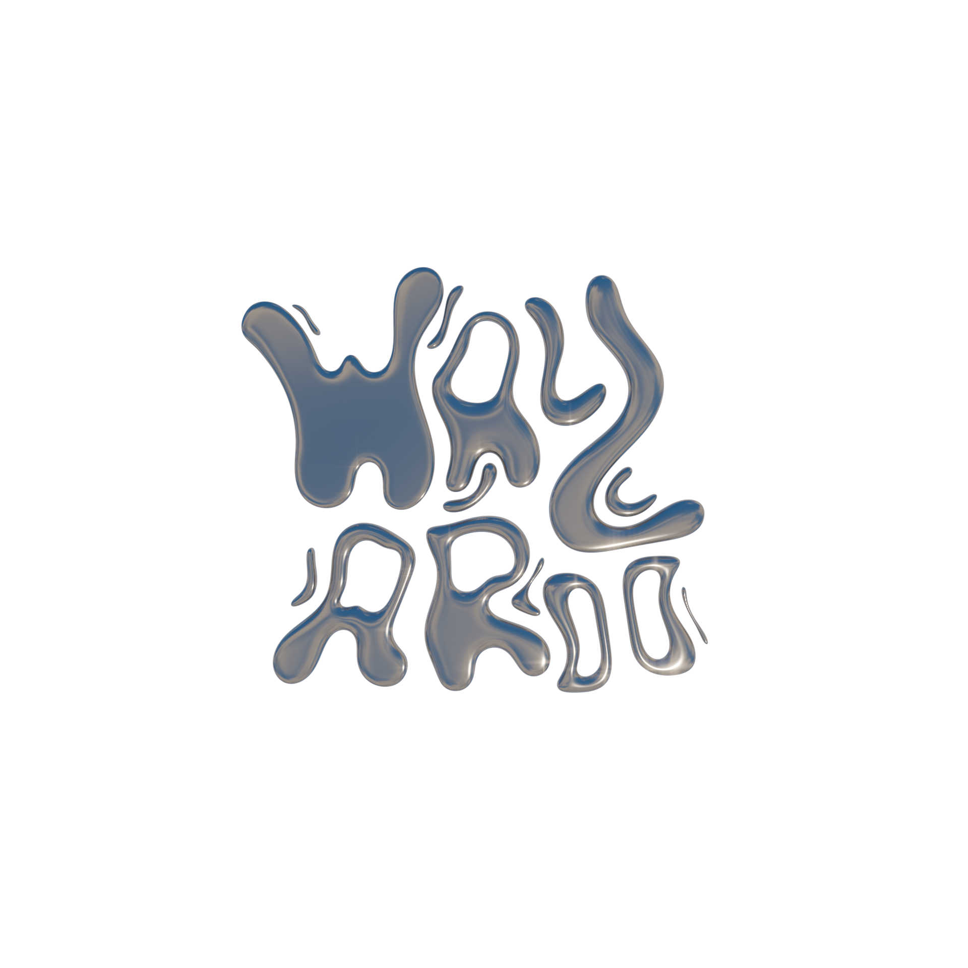
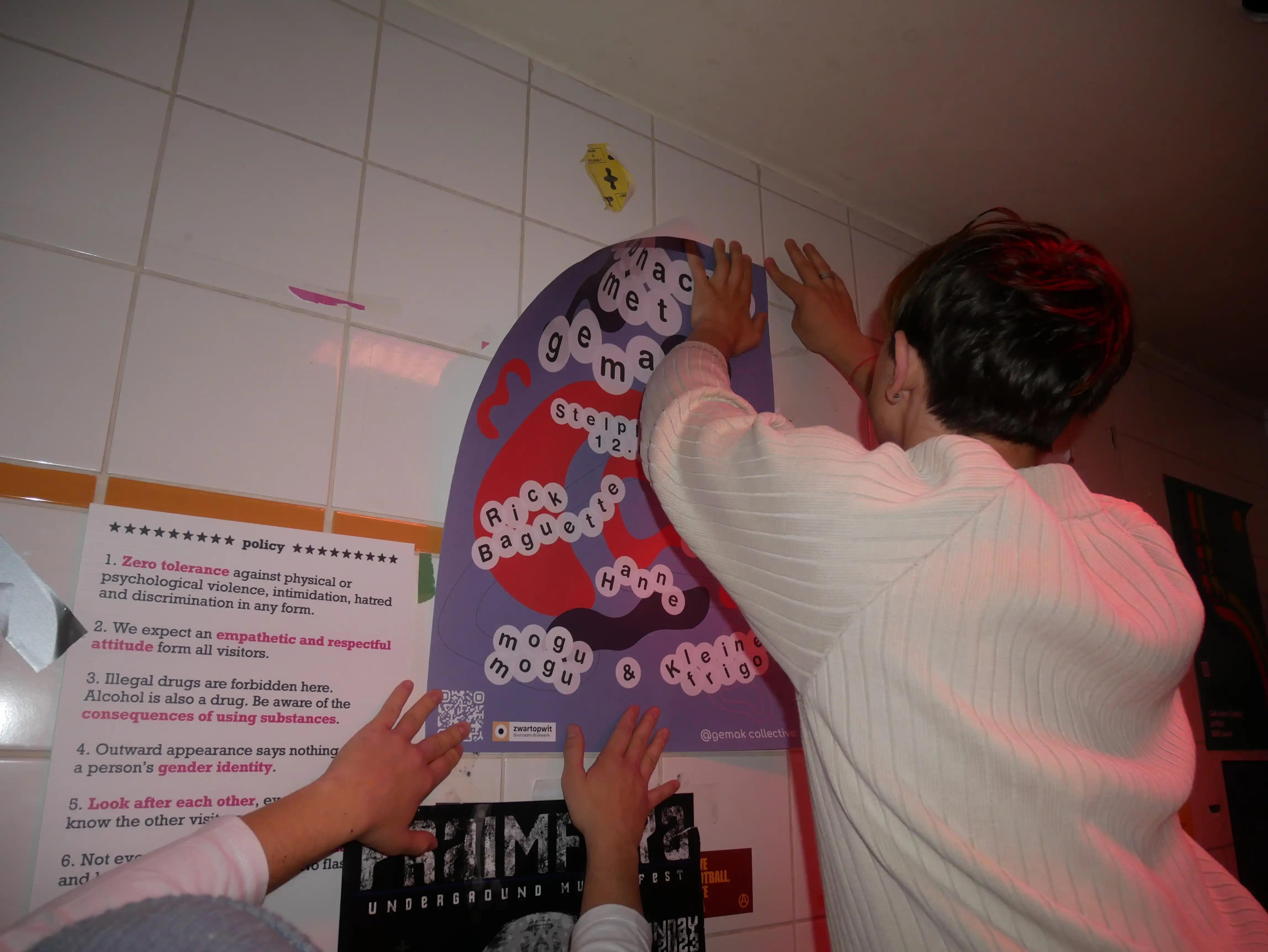
For gemak! collective’s second clubnight in 2024, I introduced a metallic and silver theme — reflecting a colder, sharper energy. This edition marked the first time we incorporated 3D elements into gemak!’s visual identity, exploring texture, depth, and motion in a more futuristic and tactile way. The branding pushed the collective’s visual world forward: still bold and playful, but with a new sleekness — more refined, a bit alien, and unapologetically shiny. From glistening assets to chrome typography, every detail was designed to feel immersive, synthetic, and strangely intimate. The result? A visual identity that evolved gemak!’s core while opening space for experimentation and surprise.
Concept & Design: Wolf Ver Elst

His work is driven by a deep interest in digital trends, sexy brands, nightlife, and cultural movement...
Inspired early on by his father — a former art director and now independent designer — Wolf studied Digital Experience Design at Thomas More and Graphic Design & Digital Media at Syntra AB. He interned at Statik and uncompressed, and now focuses on building brands and websites for emerging creatives and cultural projects.
He designs and develops custom sites in Odoo CMS, and personally manages hosting through One.com.
THE LONG STORY, SHORT:
Wolf loves discovering new ways of working and constantly pushes himself into unfamiliar creative territory. His goal is to grow into a fully-fledged digital creative: one who’s conceptually sharp, technically versatile, and artistically fearless.
His style? Accessible, bold, experimental — with a professional finish.
I mostly work with Adobe Creative Suite, and have hands-on experience with AI tools and other platforms like Figma, and Odoo.
My capabilities include: